

Brand Refresh + Packaging System
- Type : Brand Refresh + Packaging System
- Industry : Beauty / Hair Care / CPG
- Client : LocTox Hair Detox Systems
- Role : Senior Brand + Packaging Designer
- Scope : Brand Identity Refresh, Logo Refinement, Packaging Architecture, Label Design, Product Hierarchy, 3D Mockups
THE BRAND OPPORTUNITY
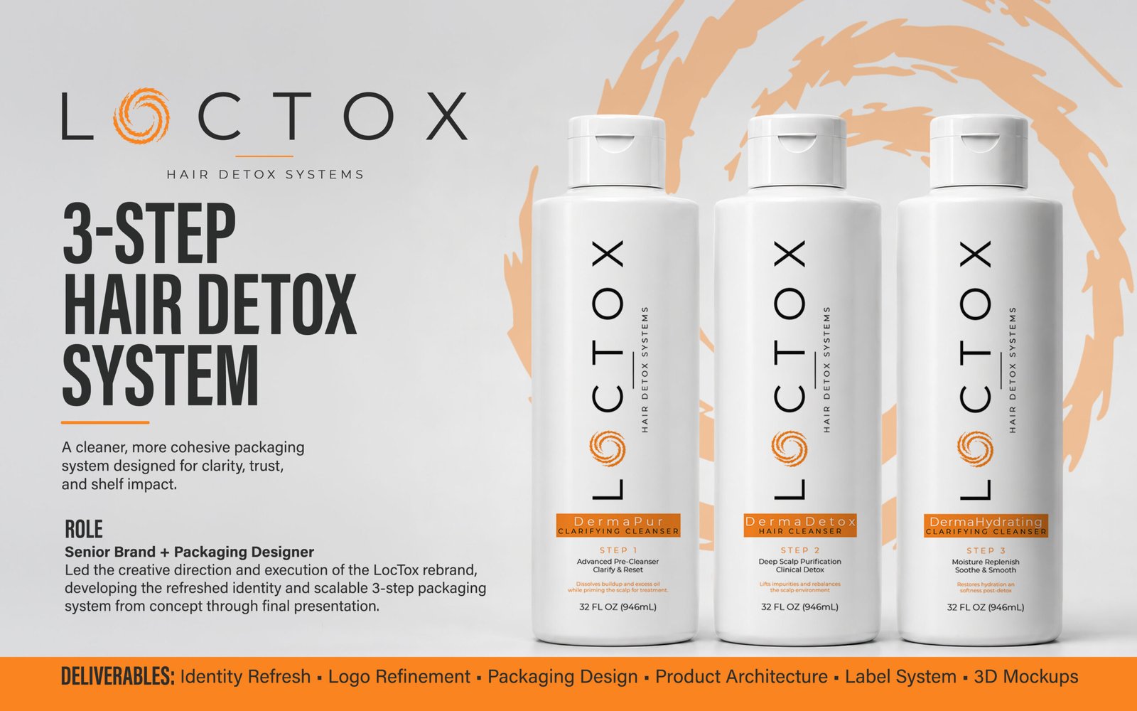
LocTox is a hair detox system built around a multi-step treatment process. The existing identity and packaging communicated the individual products, but the collection lacked a cohesive visual system that made the treatment sequence immediately understandable. The opportunity was to modernize the brand while creating a stronger, scalable packaging architecture across the product line.
THE DESIGN CHALLENGE
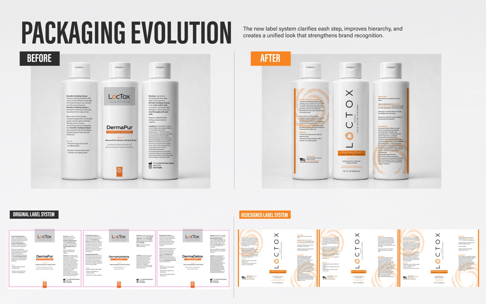
The original packaging relied heavily on text and did not establish a clear hierarchy between the brand, product name, product function, and treatment step. As the line expanded, LocTox needed a system that could improve shelf presence, simplify navigation, and maintain consistency across multiple products without losing essential product information.
THE STRATEGIC APPROACH
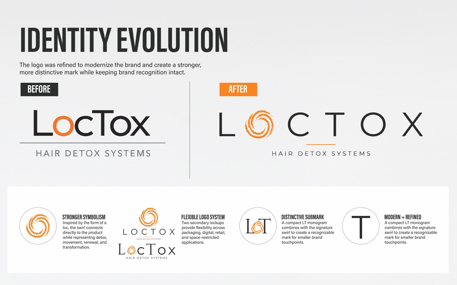
I approached the rebrand as a connected brand and packaging system rather than a series of individual design updates. I first refined the LocTox identity to create a cleaner, more distinctive foundation, then carried that visual language into the packaging through a more intentional hierarchy, consistent typography, and a repeatable graphic system. The three-product line was reorganized around a clear treatment sequence, making each step easier to identify while keeping the collection visually unified. Every design decision was built to improve recognition, simplify navigation, strengthen shelf presence, and create a scalable framework that could support future products without losing brand consistency.
DESIGN EXECUTION
I translated the new strategy into a modular packaging system for DermaPur, DermaDetox, and DermaHydrating. A consistent layout establishes the master brand while product names, function descriptors, step numbers, supporting copy, and dosage information follow the same visual framework. The organic LocTox swirl became a recurring graphic device that gives the collection visual movement without competing with product information.
-
01
Clearer Hierarchy
Brand, product name, function, and step are understood in seconds.
-
02
Easier Navigation
Prominent step numbers make the three-product treatment sequence easier to follow.
-
03
Stronger Recognition
The refreshed logo and recurring visual elements create a more memorable brand presence.
-
04
Better Shelf Impact
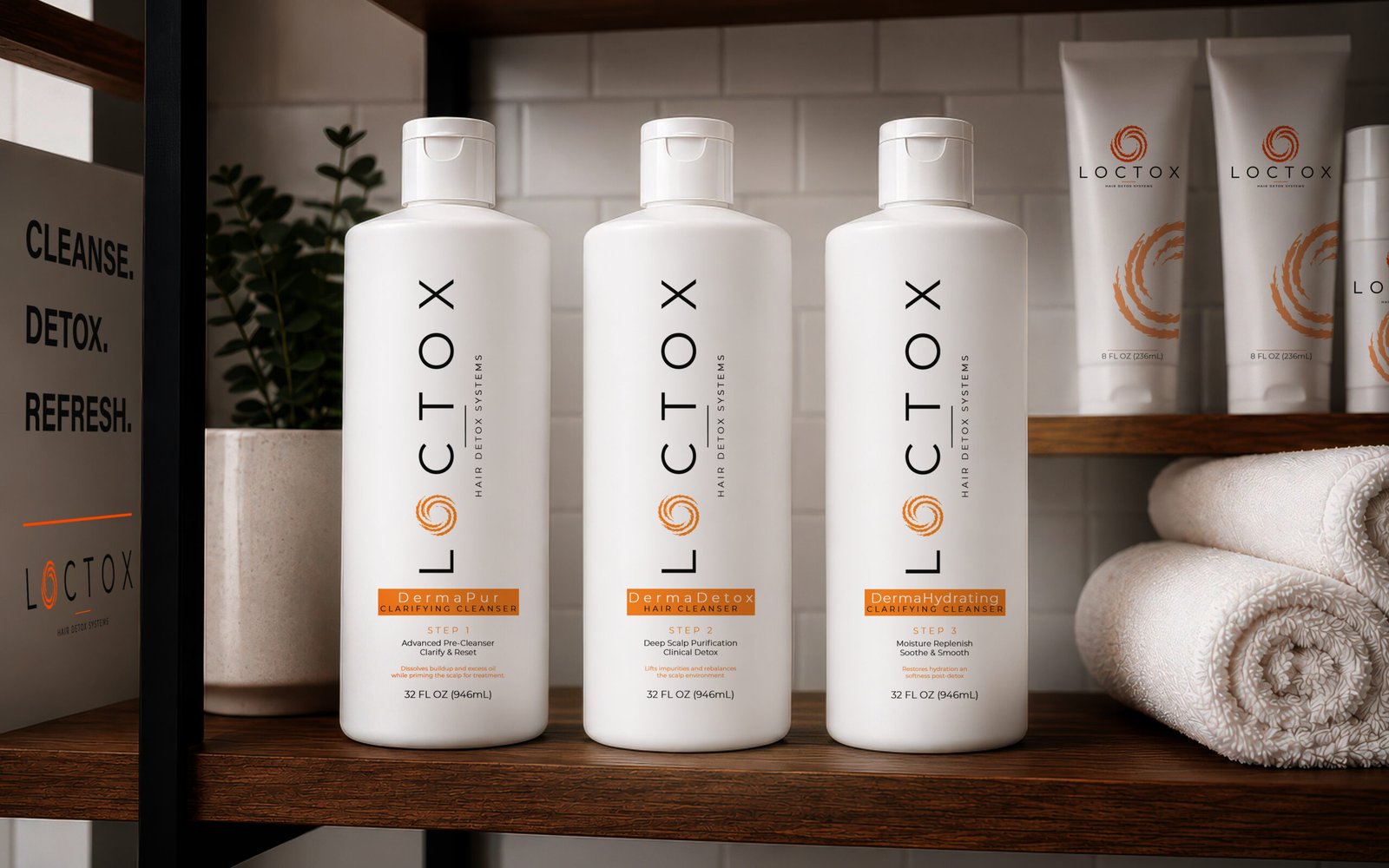
Simplified layouts and greater visual consistency help the products read as one collection.
-
05
Scalable Architecture
The modular system can accommodate additional products without redesigning the visual language.
-
06
Production Ready
The design balances customer-facing communication with the functional information required on CPG packaging.
THE 3-STEP PRODUCT SYSTEM
A repeatable visual framework connects all three products while allowing each formula and treatment stage to maintain its own role within the system.